Mütter Museum Redesign
Mütter Museum Redesign
DES Brand/ Image
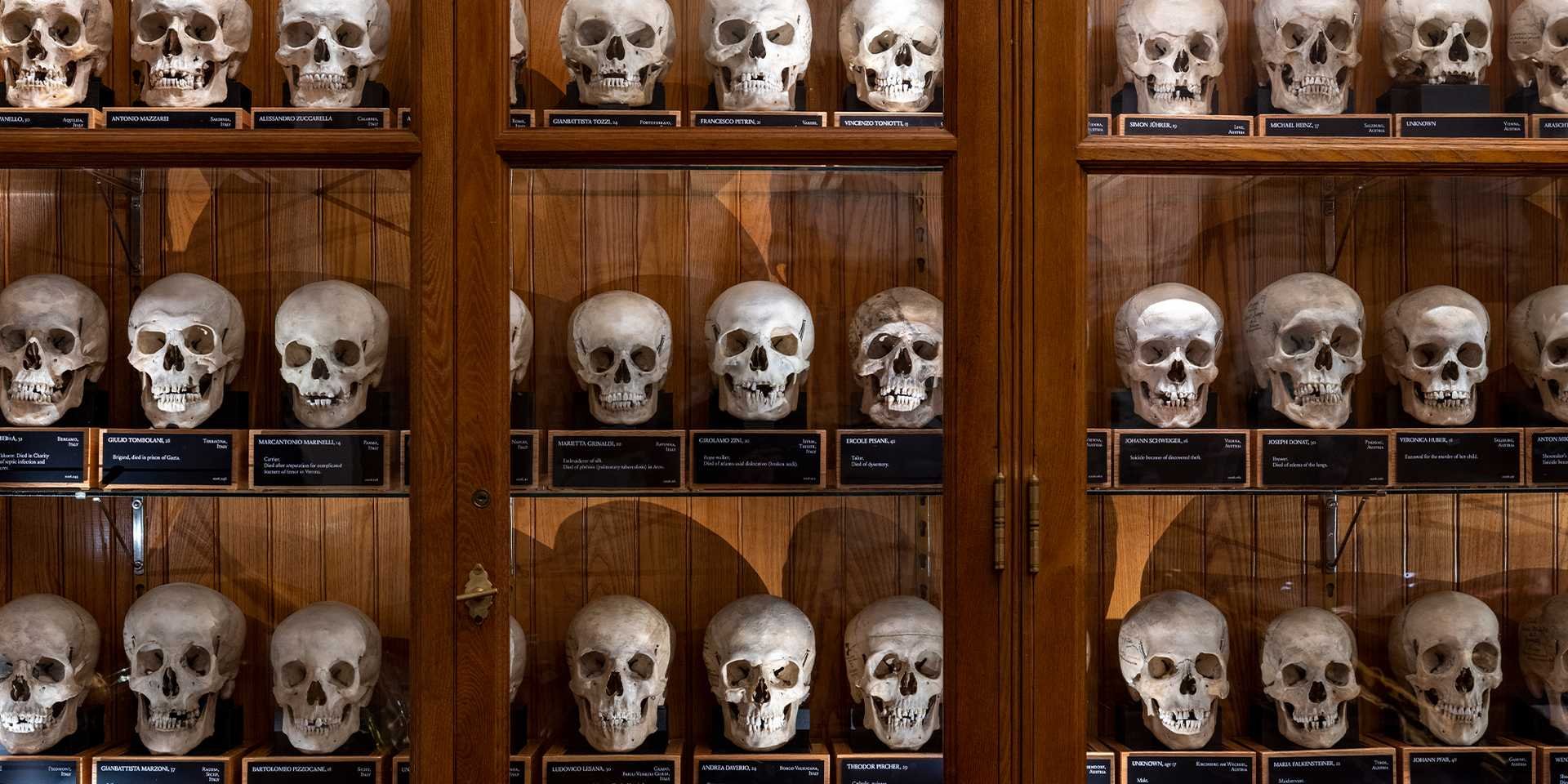
The Mütter Museum of The College of Physicians of Philadelphia began when an American surgeon, Thomas Dent Mütter, MD (1811-1859) placed a donation in an effort to “improve and reform medical education” (The Mütter Museum).
The existing brand, although very educational, promotes a spooky undertone as many of the objects in its medical collection are the remains of once living things: including humans.
It was important when redesigning many aspects of the museum to keep in mind their educational and research efforts while alluding to its long standing history.
My design choices support:
Medical research
A historical, yet modern feel
Gothic undertones
Dark imagery
Redesigned Logo
The logo of the Mütter Museum is currently a serif font in black. That being said, I believed that the logo could better support the brand of the museum if imagery was added as well.
Using Adobe Illustrator, I drew the skull and neck. A historic looking texture was added via Photoshop to the background to give the shape a more aged feel.
I decided to pair my illustration with a more modern serif font: Goudy Old Style.
The circle around my illustration is the “o” in the Goudy Old Style font. This was done purposely to make the overall visual appear less than perfect. After all, the museum is known for their abstract ideas on the medical industry and exhibitions.
Promotional Tote
The museum features several exhibitions as part of their permanent and temporary collection.
Currently, there is an exhibition featuring prosthetic eyeballs. I believed incorporating these into my design with several different color treatments and directions would make for an intriguing design filled with movement.
All eyeballs were illustrated by me via Adobe Illustrator.
A deep red, black, gray, and tan was the color palette used for my redesign.
Patron Pin
The patron pin was used to accompany my promotional tote of the museum. When someone were to enter the museum they were to hypothetically receive an eyeball pin to rock throughout the course of their visit.
My pins are inspired by their collection of prosthetic eyeballs and were drawn via Adobe Illustrator as well.
Announcement Posters:
I created a portrait and landscape poster’s on order to announce the Mütter Museum’s recent opening of the Chevalier Jackson Exhibit.
The Exhibit is a collection of objects removed from the airways of 2,000 plus patients by Dr. Chevalier Jackson.
I incorporated objects from the collection and overlayed them within x-ray images.
I paired Fairplex Wide OT coupled with Libre Franklin in order to give the poster a historical yet modern feel.
The logo was made transparent in order to look as if it was stamped in the corner.
Exhibition Website Sample
In order to promote the opening of the Chevalier Jackson Exhibit further, I decided that it needed to be featured on their website.
Good design is consistent. That being said, the same colors, imagery, and type faces were used in order to draw a comparison between the exhibition posters and the feature on the website.
Brand Style Guide (Clear-space and Sizing)
The clear space and sizing page of the brand style guide features the appropriate dimensions that the logo is to be used as well as the spacing around the image.
Brand Style Guide (Typography)
The typography page of the brand style guide features the primary font choice used as well as a sample of the font in use.
Brand Style Guide (Color Palette )
The color palette page of the brand style guide features the colors used in my redesign of the museum: CMYK, RBG, Hex codes, and Pantone treatments included.
Zoe Weimer’s Portfolio | UX Designer


